Text and Interview: Alec Coiro
All images courtesy of the artist.
The Norwegian artists Gardar Eide Einarsson had a transcontinental talk with us about his work from his new home in Japan. If there were (is?) an international school of art operating today, Einarsson should certainly be a member. Working in whatever medium that best suits his message, Einarsson might be best characterized not by the form he works in but by the meaning he works to convey. And he does not seem coy about the messages he is trying to impart. They are quite literally there in black and white, often spelled out in phrases that emerge from his subject matter. Like the best, most provocative art, Einarsson’s approach, through its recontextualization of objects and phrases, lays bare the discourse we are swimming in but never noticing. Einarsson explains all this better than we can, he also reveals an affinity for the mot justes of the New York Post.
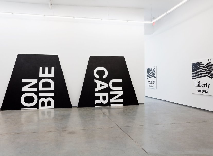
“Vulture Funds Circle Detroit” Vulcanized Rubber Tire, Steel and Coal Slag 49 inches x 27 9/16; 124.5 x 70 cm
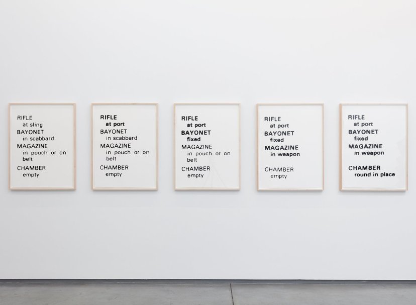
“Rifle Readiness Options” 2015, silkscreen ink on Arches paper five panels 56×76 cm
How do did you come to live in Japan?
I had been living in New York for over ten years and I was just less excited about living and working there than I used to be. My wife was raised and lived most of her life in Tokyo so I had been a lot and I just really liked the city, the strangeness, the massive size, the way it is so densely layered. It felt like a good time for me to try being somewhere else and I have a strong sense now that it was the right thing to do for both my life and my work.
Freedom, Motherfucker. Do You Speak It? was your last show in the United States. Do you agree, as some have written, that the show was commentary or a retrospective on your time in the U.S.? Was that your intention?
Ha ha, I’m not sure I’m quite done with the US yet but that show did have a pretty intense focus on the imagery and recent history of the United States and I guess I did think of it as somewhat of a love letter, or a kind of elegy, to the idea of the US as the (albeit sinister) premier moral/ industrial/ military power of the world. The installation was intended to be a kind of stylized landscape of the ruins of institutions such as the postal system, the auto industry, the criminal justice system and old school industrial villains like Union Carbide.
Have you been following the latest political discourse in the U.S. from Japan, particularly surrounding the election? As a de Tocqueville-style expert on the U.S., does it come as a surprise to you?
A lot of my work has circled around the latent violence that lurks right below the surface of polite society and how little it takes for the kind of society we take for granted to break down and of course in this election cycle the membrane between the polite surface and the murky depths of violence seems thinner than ever. For me the scariest part of Trump is how he appears as the kind of clown/ buffoon type that sometimes seems to just lead whole societies to hard turns for the worse. He has something of the self- important clownishness of someone like Mussolini or Stalin about him and I feel like there was a real glimpse of how democratic societies fall apart driven in large part by a desire (a desire which can be quite understandable) on the part of the voters to just say “fuck it, let’s just stir the pot”.
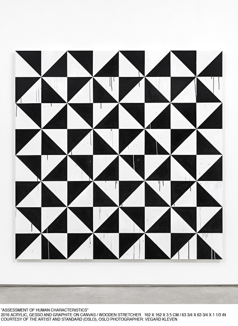
Where do you think the black-and-white color scheme derives its power from?
The idea of using just black on a white background came about because I wanted to make clear that the work came from another image, like a bad xerox. I wanted the paintings to be a representation of other images rather than a representation of the world and this was an attempt to make that clear. I feel like it also in addition to referencing a certain early DIY aesthetic had a certain brutality about it which worked well with the themes I wanted to address. I have also always felt like it was important to not try to be too technically proficient and produce paintings that were too skillfully painted as in my opinion that can become a bit of a hindrance to more interesting ways to relate to the work – so keeping it simple like that was also a way to avoid too much painterly craft.
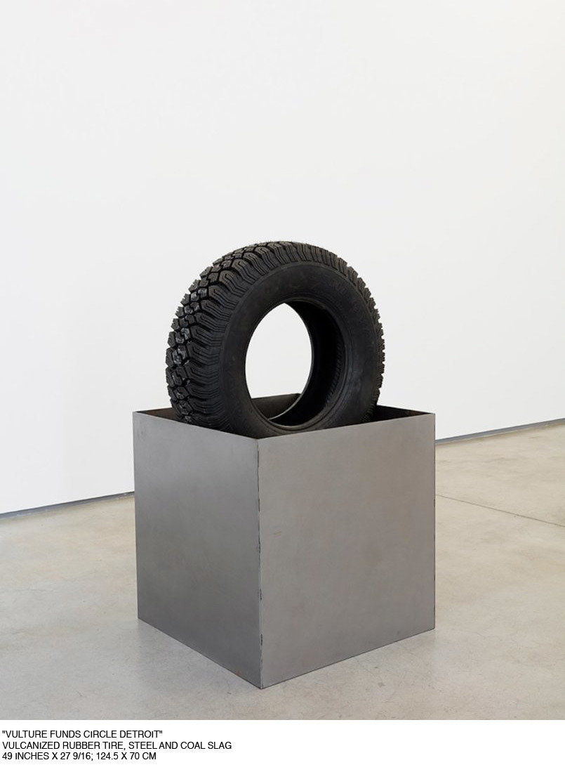
You’ve used tires more than once in your work? What is significant about them for you?
I wanted to use tires because they were everyday objects that were all around us serving one purpose in a certain context which could then be immediately turned to a different purpose once that context changed, for example, turned into a barrier by being stacked or set fire to. They are of course also linked to the automobile and its special status in the narrative of American individual liberty as well as the lost glory of the automobile industry. And they also have certain sexual connotations (many of the tires in my work are penetrated by other objects, cast bamboo rods and cones for example) and certain art historical references such as Cady Noland and Robert Rauschenberg.
How do you come to the phrases you use in your installations and as the titles of your shows?
The text I use in my work, like the imagery, is always appropriated. In most cases, the title of a piece is taken from the original visual source material. In the case of the paintings of book covers, for example, I choose the original image to be painted based in large part, often mostly, on the title or on text in the original image (that is usually removed from the actual painting). I have always been interested in playing up the disconnect between a title pregnant with meaning and a seemingly empty, flat surface reminiscent of, yet not quite (historical) abstract painting.
The show titles are usually phrases I find elsewhere, either in advertising, newspapers, lyrics, books etc.
This is more of a fan question: Chez Perv is probably one of my all-time favorite titles. I always wondered if it came from when Dominique Strauss Kahn was holed up in Tribeca and the Post used that headline?
Ha ha. Yes, exactly. The New York Post’s use of language is just so good some times – so cruel and distant and funny – and they were on fire with the DSK case. When he was fleeing the country the headline was Frog Legs It.
SHTF is up from October 20th-December 4th at Team Bungalow (306 Windward Avenue, Venice, CA).